Matcha Ritual
A sensory pop-up experience translating Rhode’s minimal, skin-focused identity into a quiet ritual of color, selection, and personalization.
“Not a pop-up,
but a ritual of pause”
Matcha Ritual - Rhode Pop-Up Experience
SoHo, New York
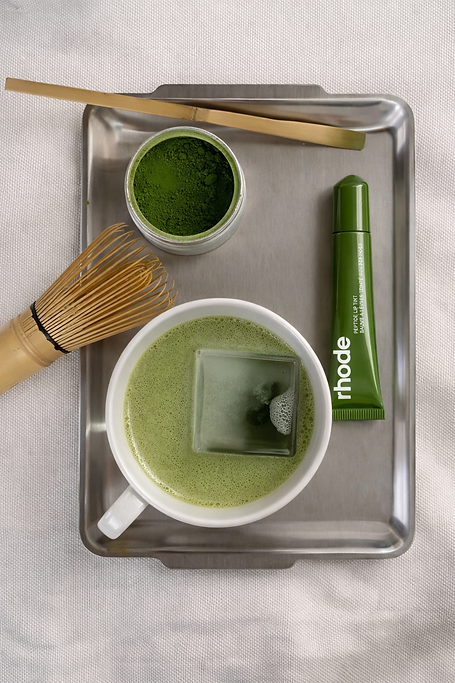
Rhode introduces a limited-edition lip treatment collection inspired by matcha, expressed through five shades that reflect varying matcha intensities.
Drawing from matcha as a symbol of wellness, slowness, and everyday ritual, the experience transforms product selection into a calm, immersive moment — inviting guests to slow down, choose intuitively, and leave with a shade that feels personal.
CONCEPT
Matcha Ritual reimagines the product selection process as a quiet moment of self-connection.
Instead of presenting the Rhode lip treatment collection as a standard product launch, the pop-up turns each shade into a sensory state. Guests are guided through a soft, monochromatic environment where matcha color, texture, and preparation become part of the choosing ritual.
The experience reflects Rhode’s identity through restraint, softness, and intentional pacing — creating a space where beauty feels minimal, personal, and calm.
BRAND TRANSLATION
The experience does not simply decorate the space with matcha. It uses matcha as a language to translate Rhode’s minimal beauty identity into color, material, pace, and guest interaction.
Rhode Identity Matcha Interpretation Experience Translation
Minimal Clean color spectrum Monochromatic spatial palette
Skin-focused Natural wellness ritual Soft, sensory product interaction
Everyday ritual Matcha preparation Slower guest pacing
Personal beauty Shade selection Individualized product moment
Calm confidence Quiet atmosphere Decompression from the city
VISUAL
DIRECTION
Color
A gradient of matcha tones guides the experience, ranging from pale green to deeper earthy shades. Each color represents a different product shade and emotional state, turning the collection into a visual spectrum of softness, clarity, and depth
Material
Natural and tactile materials support the quiet wellness language of the concept. Soft fabric, stone, glass, ceramic, and matte surfaces create a restrained environment that feels clean, grounded, and intimate.
Light/ Atmosphere
Lighting is diffused and gentle, designed to slow down the pace of the guest experience. Instead of bright retail lighting, the atmosphere feels soft and quiet, creating a moment of pause away from the city
The visual language is soft, minimal, and sensory, using matcha as both a color system and an emotional tone.

The space avoids high-contrast retail energy and instead creates a calm, monochromatic environment that feels closer to a beauty ritual than a commercial pop-up


EXPERIENCE &
JOURNEY
Guests are guided through a four-step ritual

01 ARRIVAL
decompression
Guests step out of SoHo and enter a softened, monochromatic environment. The sound, lighting, and material palette immediately shift the pace, creating a sense of calm before the product interaction begins.
02 SELECTION
intuitive choice
At the center of the space, guests encounter a matcha color spectrum featuring five shades inspired by different matcha intensities. A minimal prompt guides each guest toward the shade that reflects their current state.
The act of choosing becomes less about product preference and more about feeling, mood, and personal rhythm.
03 TRANSFORMATION
sensory witnessing
After choosing a shade, guests are invited to witness a quiet matcha preparation moment. The selected tone is reflected through texture, movement, and sensory detail, connecting the product shade to the ritual of preparation.
This moment turns the collection from something visual into something experiential.
04 PERSONALIZATION
memory
Guests receive a tailored product card based on their chosen shade, paired with the corresponding Rhode lip treatment. The card captures their selection as a personal memory, allowing the experience to continue beyond the pop-up.
EXPERIENCE DETAILS
MATCHA SHADE SPECTRUM
A central installation presents five Rhode lip treatment shades through a matcha-inspired color spectrum. Each shade is paired with a minimal descriptor, allowing guests to choose through mood and intuition rather than traditional product testing.
Includes: five shade display, matcha intensity labels, soft product lighting, minimal prompt card.
SELECTION RITUAL CARD
Each guest receives a small card that records their selected shade and the feeling associated with it. The card functions as both a guide during the experience and a keepsake after the visit.
Includes: shade name, matcha intensity, short mood description, product pairing.


